What kind of art can I use in a Maximalist interior?
- Posted on
- By Roy Caro
- Posted in Less is a Bore, Maximalism, Maximalist, More is More, What kind of art can I use in a Maximalist interior
- 0
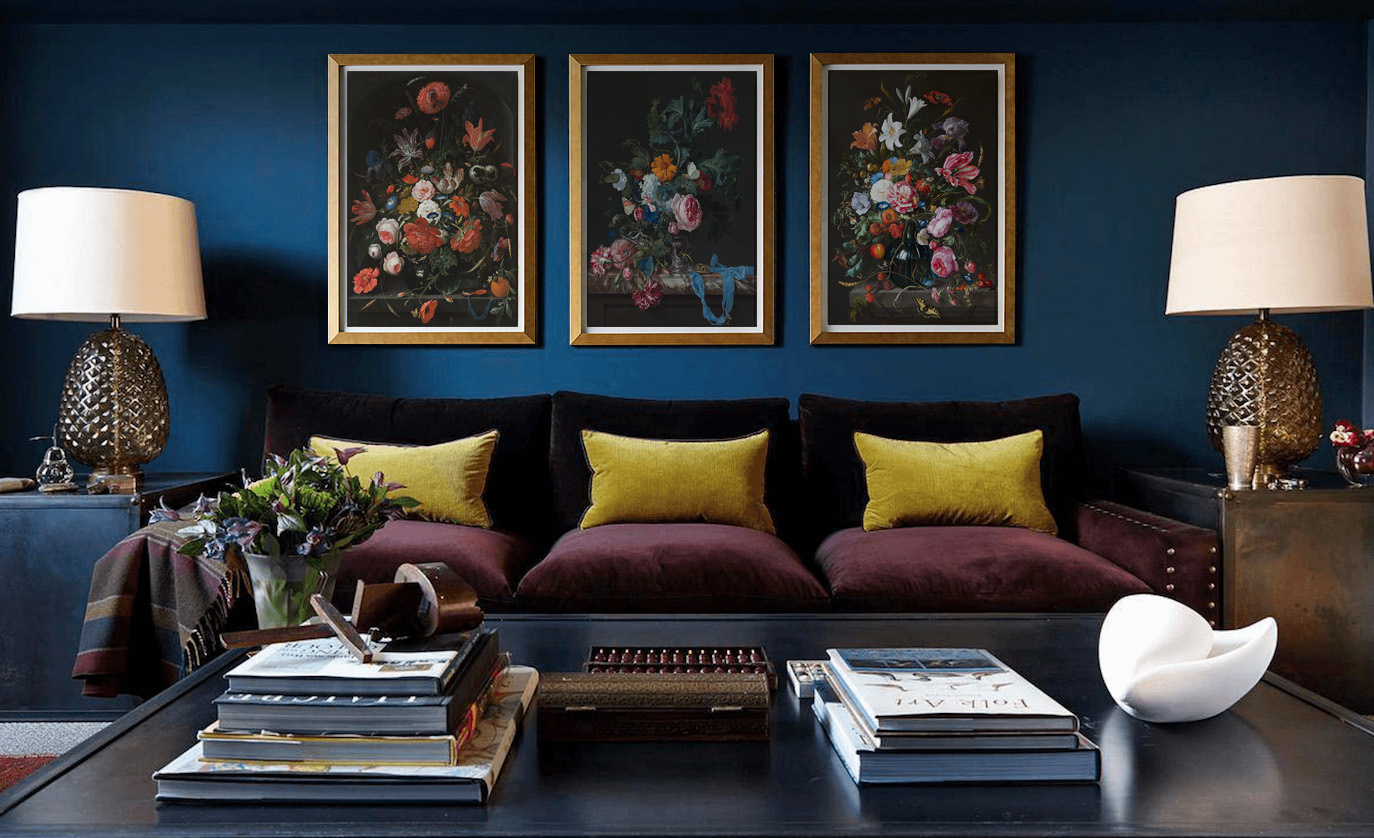
In the arts, maximalism, a reaction against minimalism, is an esthetic of excess and redundancy. The philosophy can be summarized as "more is more", contrasting with the minimalist motto "less is more"
THE RISE OF MAXIMALISM IN DESIGN
ELEMENTS OF MAXIMALISM
Since about 2016, those exquisite maximalist interiors you may have seen on Pinterest or Instagram can feel intimidating. It is essential to remember when maxing out your design style it is all about your client and your unique taste. "Maximalism is, in a way, much more personal than minimalism. People are not just one thing; they are complex and multifaceted—and maximalist decor expresses that. This style allows your clients personality and experiences to shine through much more easily than in a minimalist space.
When it comes to identifying a maximalist space, these are some key characteristics:
- Layering
- Repetitive patterns in prints such as florals, abstract, and animal prints
- Rich, bold saturated colors
- Gallery walls of strong art and photography, preferably old masters.
- Unique statement pieces
- Modern photography of architecture and urban life printed in acrylic
- Mixing and matching of textures and colors
- Multiples of items like books, statues, artworks etc.
- Blending of styles—oftentimes but not limited to classic, eclectic
Modern design is embracing this new and expressive trend with eagerness. Soon, minimalism design will take the backseat as maximalism steps forward. We will be seeing a lot of layers, diverse materials, metallic leaf and bold wallpaper in the months to come. Reach out to us when you need your maximalist artwork.
For the past few years, the world of design has been immersed in the trend of minimalism. It has been a popular approach to clothing, furniture, art and as a lifestyle. Minimalism was a way of keeping things simple with bare essentials, basic shapes and monochromatic palettes. However, as minimalism makes its way out, maximalism is beginning to take its place.
If this is the case, what makes up a good maximalist design? Maximalism is defined by the opportunities it presents. It welcomes diverse aesthetics, excess, decadence and extravagance by breaking traditional design rules. Here are four elements used to compose great maximalist design.
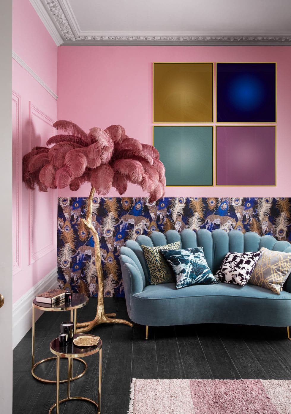
Brave color
Courageous color choices and combinations are present in good maximalist design. There is no fear of bold, bright, vibrant or saturated hues. Feel free to create palettes that clash. Color should be playful and used in a variety of ways. Whether you’re painting your walls with bold colors or creating bright compositions as a graphic designer, brave color is the way to go. So, decide on a few colors and then choose a few more!
Texture
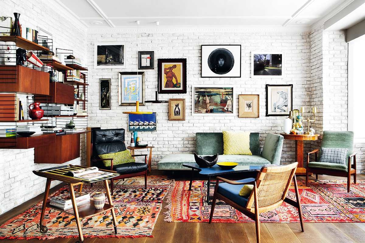
Texture can be added in a number of ways with different techniques. A textured look can be created with layers of color and pattern. Mixing and matching these elements generates an implied surface by creating contrast. Maximalist design is full of compositions that create depth. This can be achieved through many different mediums. While a photographer will use literal contrast to tell the viewer about the surface, an interior designer can play with fabrics and objects to explore texture.
Pattern
Pattern can be used heavily to your advantage when putting together a maximalist design. Use patterns and a lot of them. Filling a space with a bold and repetitive pattern as well as using patterns that are visually loud and eclectic points to all that maximalism is. With maximalism, more is more.
Motif and repetition
In design, a motif is usually a dominant idea or central theme. This can be created with a repeated design, pattern or color. This is what ties a maximalist design together and creates harmony amid what appears to be chaos. Where there is consistency, there is unity. Repeat those bold colors, keep bringing in that shape or stick with the same theme. While it might be excessive and full, it will bring a sense of unity to the composition as a whole.
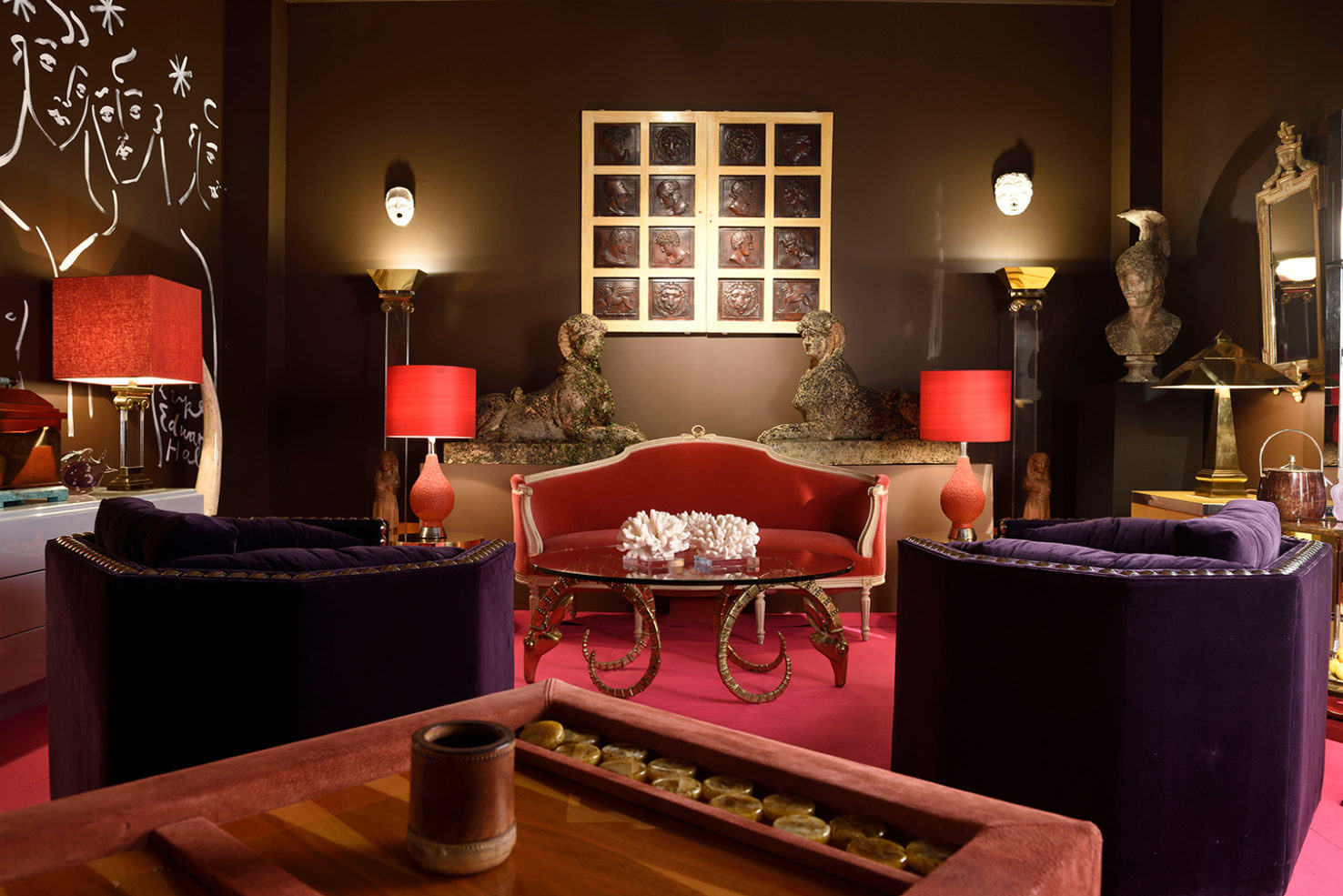
A ‘Disco Drawing Room’ designed by Luke Edward Hall for London store Talisman. Photography: Bill Batten
Artist and designer Luke Edward Hall thinks this is a backlash against digitized perfection: ‘We are spending so much time looking at screens that we want our homes to be more ‘real’ – more layered, more textured, full of objects we’ve collected and loved.’ ‘The world can be quite a grim place sometimes and maximalist interiors provide an escape – a fantasy in which to lose yourself,’ he says. ‘I just see it as wanting to be surrounded by lovely things.’
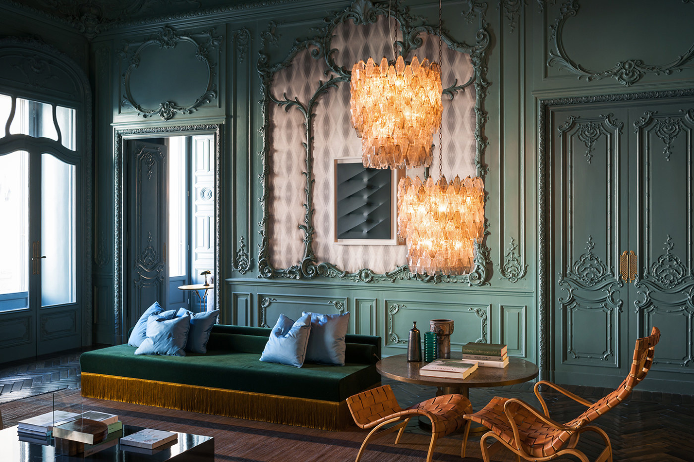
Palazzo Fendi’s VIP apartment. Photography: Andrea Ferrari
Founders Emiliano Salci and Britt Moran describe Dimore Studio as moving between design and art, architecture and fashion. ‘We create interiors that mix styles, periods, materials, colours, lightness and darkness, old and new,’ they say. ‘Nothing inspires us more than the patina of time, reinterpreted in sophisticated, contemporary decors, to create a specific mood. The result is an aesthetic that is not only hauntingly beautiful, but also unique.’
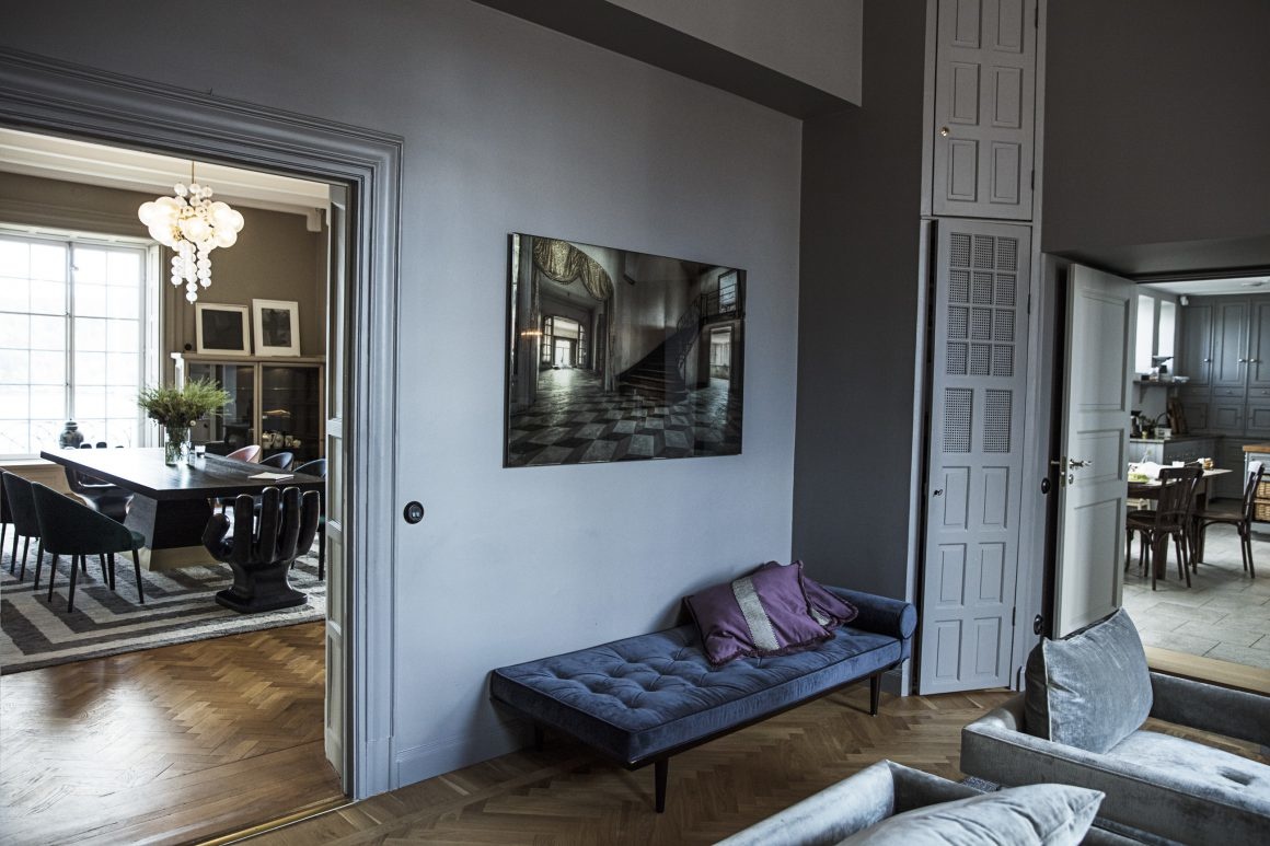
Malin Glemme had so many enquiries for maximalist design and today Layered is redefining Scandinavian design. ‘I have always been drawn to looks with a strong personality, expressed through bold patterns, colors and shapes,’ says Glemme.
‘Scandinavian design has been well-known as Minimalistic, but that’s not all of the truth,’ she adds. ‘The last few years, there’s been a slow return of a more colorful, vibrant design inspired by Swedish Josef Frank and the “Swedish Grace” movement.’
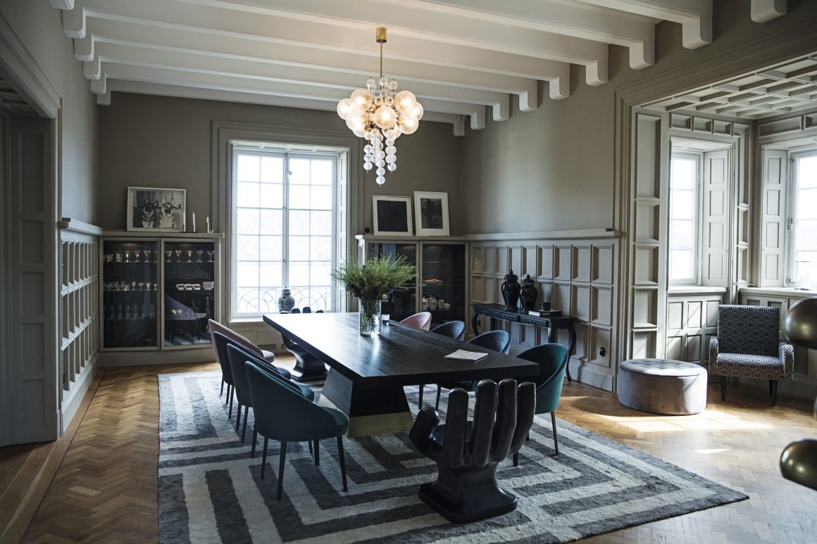
ART THAT REFLECTS YOUR CLIENT'S HOLISTIC PERSONALITY
Interior designers ponder a extensively about visual alignment with the space they are designing but it is never the main motivation for selecting artwork. They always try to source a great piece within the project's budget, which will also visually resonate with the client’s aesthetic taste.
Design professionals spend many hours studying their client's temperament and stories, to choose images that will appeal to their preferences and personality.
Generic art often doesn't reflect the client’s aesthetics. In fact, ill-defined, powerless wall art just doesn’t communicate. We believe that art should make a statement and connect with the viewer.
In Maximalist decor, all elements are competing to draw attention and there is no place for boring art. ''More is more'' is the final goal.
The Picturalist proposes a selection of powerful images which interior designers can place side by side with their most detailed and colourful decorative elements, creating the right drama, attention and impact.
As always, if you have any questions, please feel free to reach out to us.
It will be my pleasure to personally answer your questions.
Roy Caro Cohen
The Picturalist
info@the picturalist.com
1-833-742-8872
When you’ve completed a design for a client, you need art and you need it yesterday. The Picturalist has that covered.
Interior designers and showrooms can choose from hundreds of contemporary images specifying the perfect frame to accent their clients style. In today’s instagramable world, The Picturalist delivers quickly to his followers. We know interior design projects need the perfect artwork to complete the look, so The Picturalist guarantees delivery within a week. Browse our website and add images to your decor ideas.



Comments
Be the first to comment...